


Generation Press
This is the second talk that I have been to by Generation Press, still just as interesting as ever. It's great to see a graduate from our course doing so well.
What print is still commercially viable today, in the digital age. Print is exciting again, people want something physical, to touch, feel even smell.
A lot of printers are forced by the market to make cheap and quick prints, which devaluates the printing industry. Generation Press still strive for quality and perfection.
The surface of the paper determines the dot gain, something that needs to be taken into account when deciding between different stocks and transferring design from digital to print.
It is particularly hard to print photographs on uncoated stock, this is because you want a coated look with an uncoated feel, which is difficult.
Different techniques to colour edge, handcrafted and mechanical methods- Generation Press were very secretive about their process.
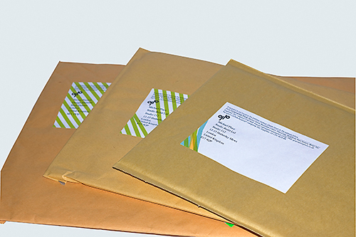
The Not For Commercial Use project was to comment on the relationship between graphic designers and printers.
Generation Press' branding was centralised around using their own coloured paper. They added their own pigments to the paper to make it unique. They named it after their colour technician, Barry(y)ie.


Si Scott
I love Si Scotts work, he has such a unique and personal style of working which is clearly always evolving. Really very beautiful.


Anthony Burrill
Very influenced by technical drawing early on, initially by a school text book 'Design Drawing One'.
I love this concept for Hans Brinker budget hotel. Executed effectively, using simple imagery and striking straight forward type.


Keeping the typography strong and straight, but keeping the human, stuck down feeling to it.
Acid Washed
Daisy Daisy Sunday Best
These examples of motion graphics are great, especially after working with Lorraine about using the sound to direct your animation. Some great examples of this, and very appropriate to what we're working on at the moment.


No comments:
Post a Comment